AS G321: Main Exercise research
I analysed the front cover, contents page and double page spread of a music magazine. I picked out and anaylsed key features and how they were used to attract the target audience. I looked at elements such as font, colour, layout and pictures, things which make a huge impact on whether the magazine is successful in attracting its target audience. By analysing these magazines, it gave me a clearer idea of how I would want to try to attract my target audience and suitable things I should include.
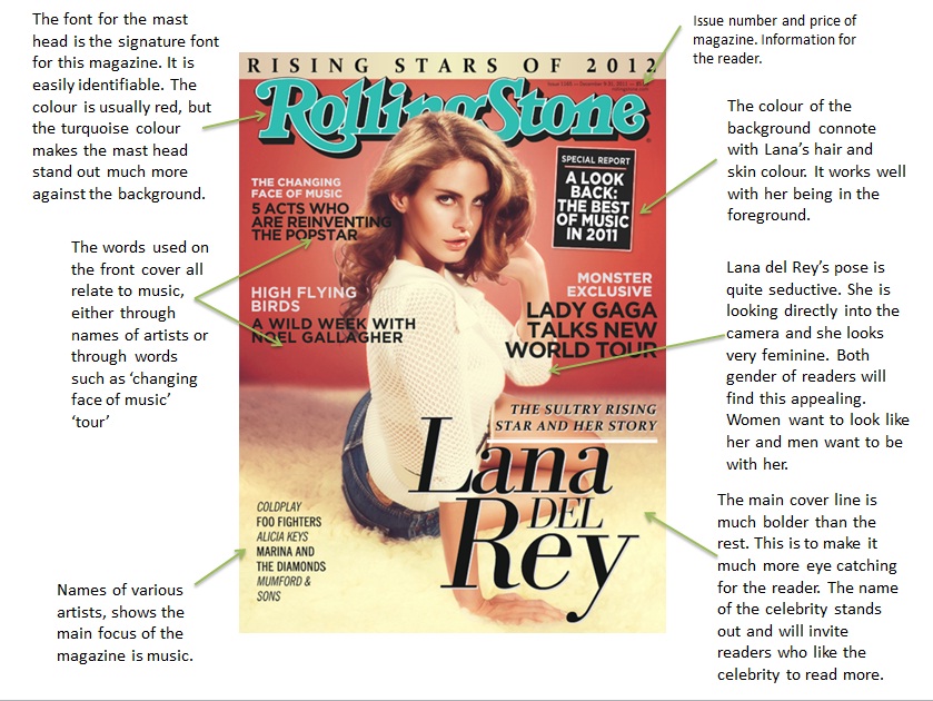
Front Cover Analysis
Denotation:
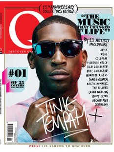
This is a front cover from the music magazine Q. It has the 'Q' logo in the left hand corner with the main focus being on the model, Tinie Tempah, who is in the centre of the page. The words 'Tinie Tempah' is written in the foreground with a font that looks like handwriting, this gives the impression it is a signature from the celebrity. The picture is in colour with various cover lines down one side of the page. There is a main cover line which reads 'THE MUSIC THAT CHANGED MY LIFE' this creates interest as the reader will want to read on.
Masthead:
‘Q’ magazine’s has a signature masthead as it never changes. It is always placed in the left hand corner, in a serif font and is always red and white. This allows the magazine to be distinctive and for people to easily recognise whihc brand it belongs to. The connotations of white are purity, heaven and cleanliness, whereas the connotation of red is danger, anger, passion and love, therefore these colours are very contrasting against one another.
Main Image:
The main image consists of Tinie Tempah looking as though he is doing up the top button of his shirt. He appears to be quite mainly and has a very serious expression. This could show that he wants to be taken seriously as an artist. He looks as though he has a high status and authority which makes him look important.
Mis-en-scene:
He is wearing a shirt and glasses which connotes formality and gives the image a seriousness, this makes the reader take the artist much more seriously. The shirt is pale pink which also suggests formality and doesn't stand out too much so the main focus is on his face. On the other hand, the sunglasses are much less formal but as Tinie Tempah is always seen in glasses, it is like his signature item.
There are no props which also allows the reader to focus solely on the artist and nothing else. This relates to his expression as he appears to be very confident and broad.
He seems to be looking straight into the camera behind the glasses, this makes him seem superior and serious as he is making eye contact with the audience. However, as he is looking behind glasses, it creates a sense of mystery and makes the reader wuestion whether he is looking straight ahead or not. His head and body are facing forward which suggest his eyes are too. As he appears to be doing up his shirt, his hands are very close to his chest which connotes he is secretive and closed, however the interview in the magazine might open him up and reveal his secrets. This will interest the reader as they will want to know about the artist.
The lighting seems to be from a high angle which makes his face bright and clear, allowing the reader to see his facial expression much more clearly. There is also coloured lighting, a blue light which is coming from below, it highlights his face and sets a different tone to the image. Blue connotes sadness and calm which relates to his facial expression.
Coverlines:
There aren't many coverlines on the front cover, which is odd for a magazine. The main cover line reads, "THE MUSIC THAT CHANGED MY LIFE" this is a quote, possibly from Tinie Tempah. This creates an interest as the reader will want to find out what he is talking about. The words, "CHANGED MY LIFE" shows the seriousness and importance of what he is talking about and makes it more fascinating for the reader. The black font connotes danger, darkness and makes the coverline stand out against the light blue background.
The other pieces of text on the page are names of artists which informs the reader of who they could read about and expect to find inside the magazine.
Double Page Spread Analysis
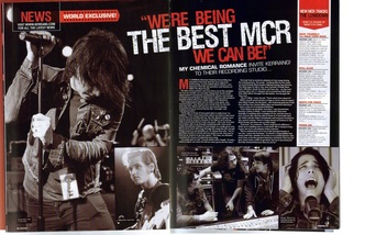
Denotation:
The double page spread is an interview with the band My Chemical Romance, from the magazine Kerrang. The colours used are red black and white and there have been several pictures used on the pages. The text has been split into two equal columns which gives the text a neat layout. The text stands out against the black background and the title, 'WE'RE BEING THE BEST MCR WE CAN BE" makes a statement as it stands out and as it is capitalised, is the main focus of the page.
Image:
The image of the lead singer, Gerard Way, takes up a full page of the double page spread. It has been taken during one of their concerts so the reader is able to see what they would look like as they're working. He is slouched forward and looks as though he is hiding away from the camera as he is not looking at it and his hair is brushed over his face. This connotes a sense of shyness and lack of confidence, and also the slight part of his face that can be seen looks sad and he appears to be looking to the ground.
The smaller images show various things such as the bands guitarist, the band working and Gerard Way singing. This gives the audience a variety of images to look at and makes the page much more interesting.
Mis-en-scene:
Gerard Way appeas to be wearing very dark clothes along with his dark hair, this represents the stereotypical view of rock as it is represented by dark colours such as red and black. The colour black connotes death, rage and aggression which is the stereotypical idea of rock and roll bands. The microphone he is holding in the maiin image shows that he must be at a concert or a gig, performing his music. This could show he takes his music seriously and wanted to be captured in the photograph while performing.
The lighting in the photograph is quite low and dark, shadows are clear which connotes secrecy much like Gerard Way's body language. The low key lighting is used throughout the whole of the double page spread as it makes the pages flow more consistently.
Colour Scheme:
Again the colours used in the double page spread are black, white and red. These are very dark colours whcih represent the idea of rock. I think if bright colours were used on the page, it would not look appropriate and the readers would not be as interested. Kerrang magazine primarily use dark colours throughout their magazines as it reflects the genre of music which they focus on. I think that the dark colours work best with the genre of rock and are the colours which the target audience are most familiar with.
