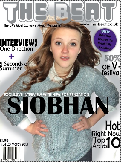
Final Front Cover
This is my final for my front cover of my magazine. From my draft I made various changes such as the image I used, the font and also the layout. With the image, I wanted the model to look like a popstar as that is the genre of my magazine. From my draft it seemed quite plain and didnt make a huge impact like i wanted it to. However, with the new image I feel as though the model looks strong, independent and would be someone for teenage girls to look up to. With the font I used, before it seemed very boring and was all the same, but I changed it to make it vary across the page. I downloaded some unique fonts I wanted to use into Photoshop and incorporated them into my work. The masthead seems more suited for the genre of magazine I was aiming towards as it seems fun and really stands out. Also, the font I used for the cover lines changes both in font and colour. This, I felt, made it more exciting to look at. I used the colours purple, black, and some grey which all corresponded with my colour pallette I created earlier. I also added key features such as a website, price, date and barcode to make it match the conventions of a normal magazine. I also wrote a selling line, "The UK's Most Exclusive Music Magazine", I felt this made the magazine stand out and made it look more important. Overall, I am pleased with my final outcome.

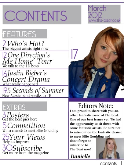
Final Contents Page
This is my final contents page. Through the influence of existing contents pages, I created my contents page so it would look very organised and it would be clear to read what pages were where. I included a title, date and website which were features i had seen of contents pages and felt it would make mine look slightly more professional. I created two seperate sections for pages, 'FEATURES' and 'EXTRAS', I felt this showed the reader what pages they may find more interesting and the stories that were the biggest! I also chose to include an image of an artist who would be featured in my magazineand i felt adding an image gave the reader slightly more to look at and prevented the page from becoming boring. I feel, in comparison to my first draft, my contents page has improved due to the changed of font, layout and the addition of certain features. I also wanted to include an Editors Note as, again, i felt it made the magazine slightly more official. I kept to my colour scheme when creating my contents page because, from audience feedback, they felt the colours worked well together.

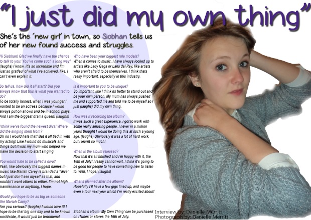
Final Double Page Spread
This is my final for my double page spread. I am happy with the outcome as I feel it looks professional and is easy to read. Again, I kept to my colour scheme on this page as i wanted the magazine to flow. In terms of lamguage, i kept the language quite informal and chatty and i wanted it to be an easy read for the audience, i wanted to give them something they would enjoy and feel comfortable reading. I felt this was best as my target audience is teenage girls, they wouldn't want to read something whcih is very formal because my magazine is a pop magazine, i thought it needed to be fun and exciting. I had seen on previous examples, when writing the interview, the questions were a different colour to the answers, i wanted to use this in my product as i felt it made it clear for the reader what was happening and who was speaking when. I think it also is visually much more appealing for the reader. I liked the capital letter behind the text, I had seen it be used in a few magazines previously and thought it was a good feature to include. I changed the opacity levels in Photoshop as to make it fade slightly into the background. The image i chose to use, i think works well as it is quite an elegant image, it doesnt distract your attention away from the text too much which is good. I blended the image over to the other side of the page slightly to make it flow and not have a clean, straight line down the middle.